Tag Archives: Christian Louboutin
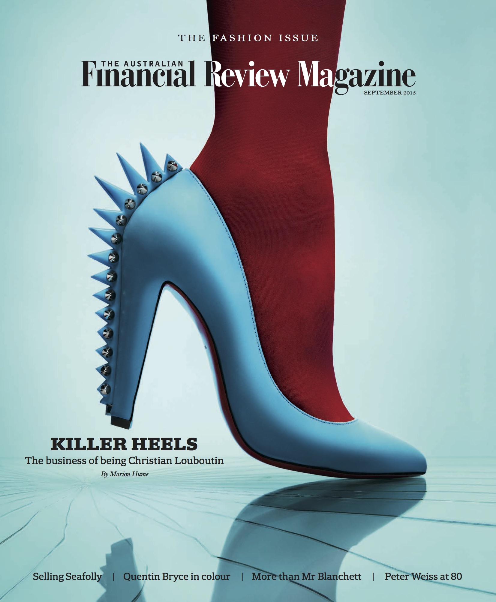
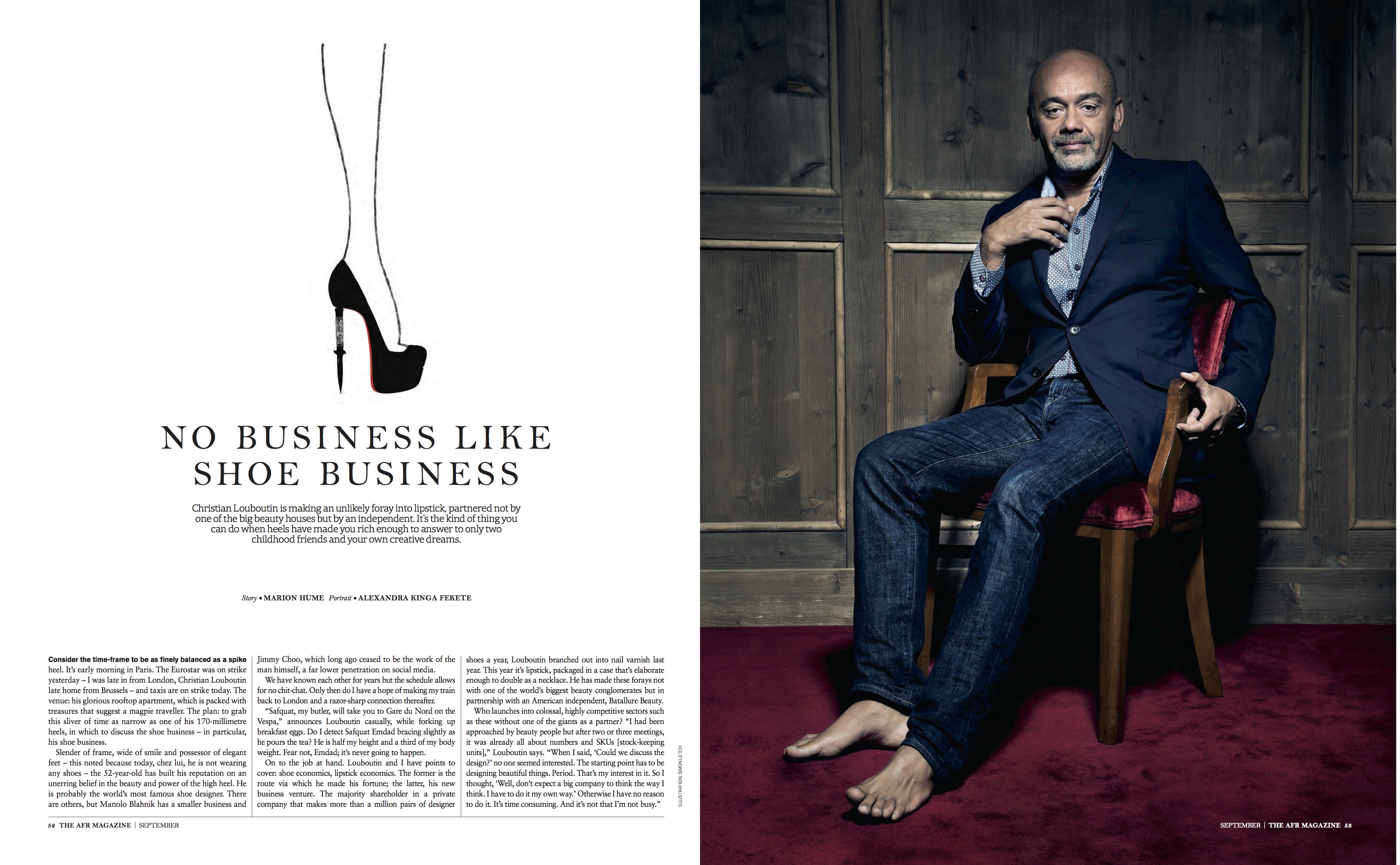
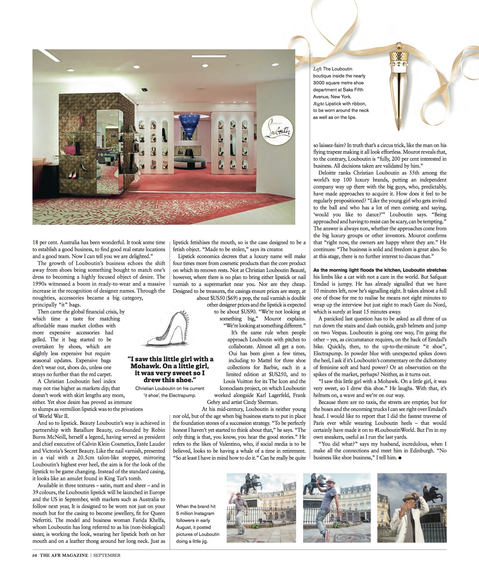
NO BUSINESS LIKE SHOE BUSINESS – AFR Magazine
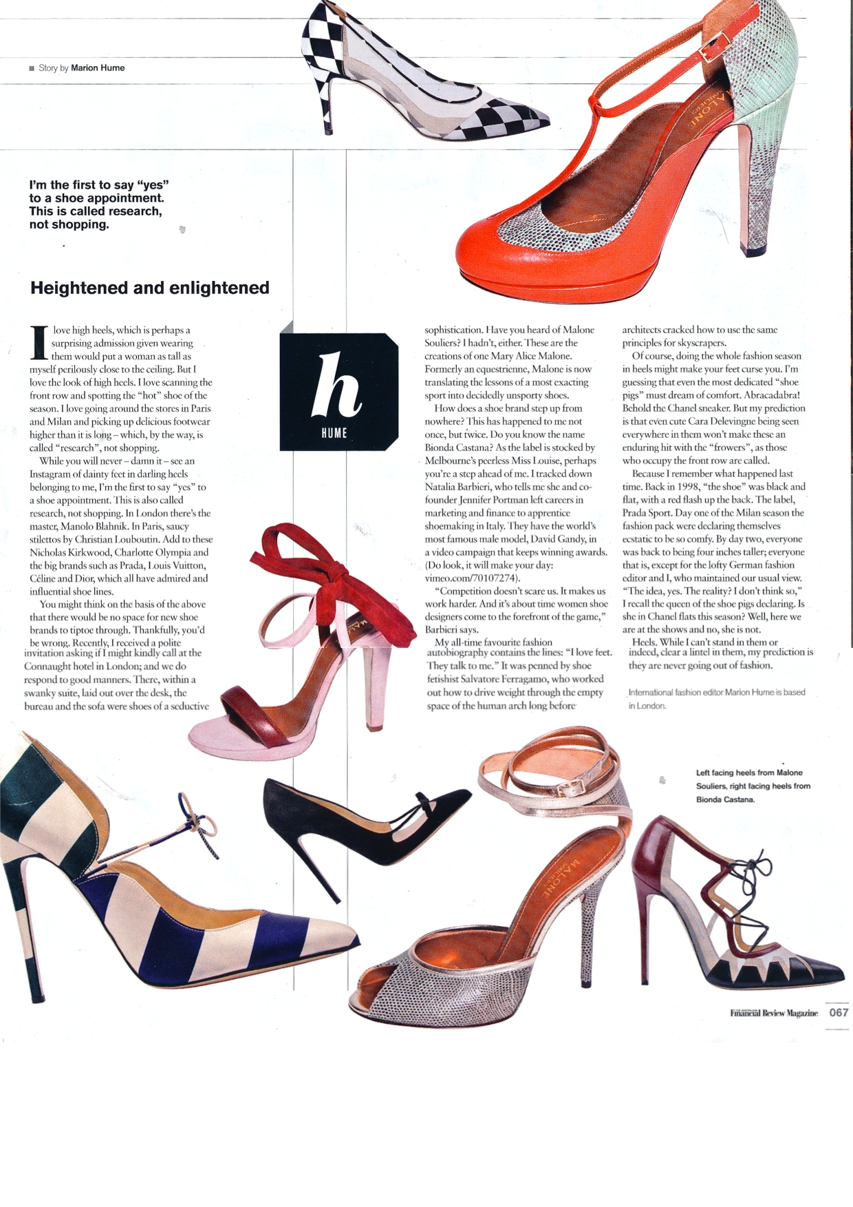
heightened and enlightened – AFR
Rainbow – Australian financial review
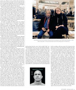
AFR | 2012
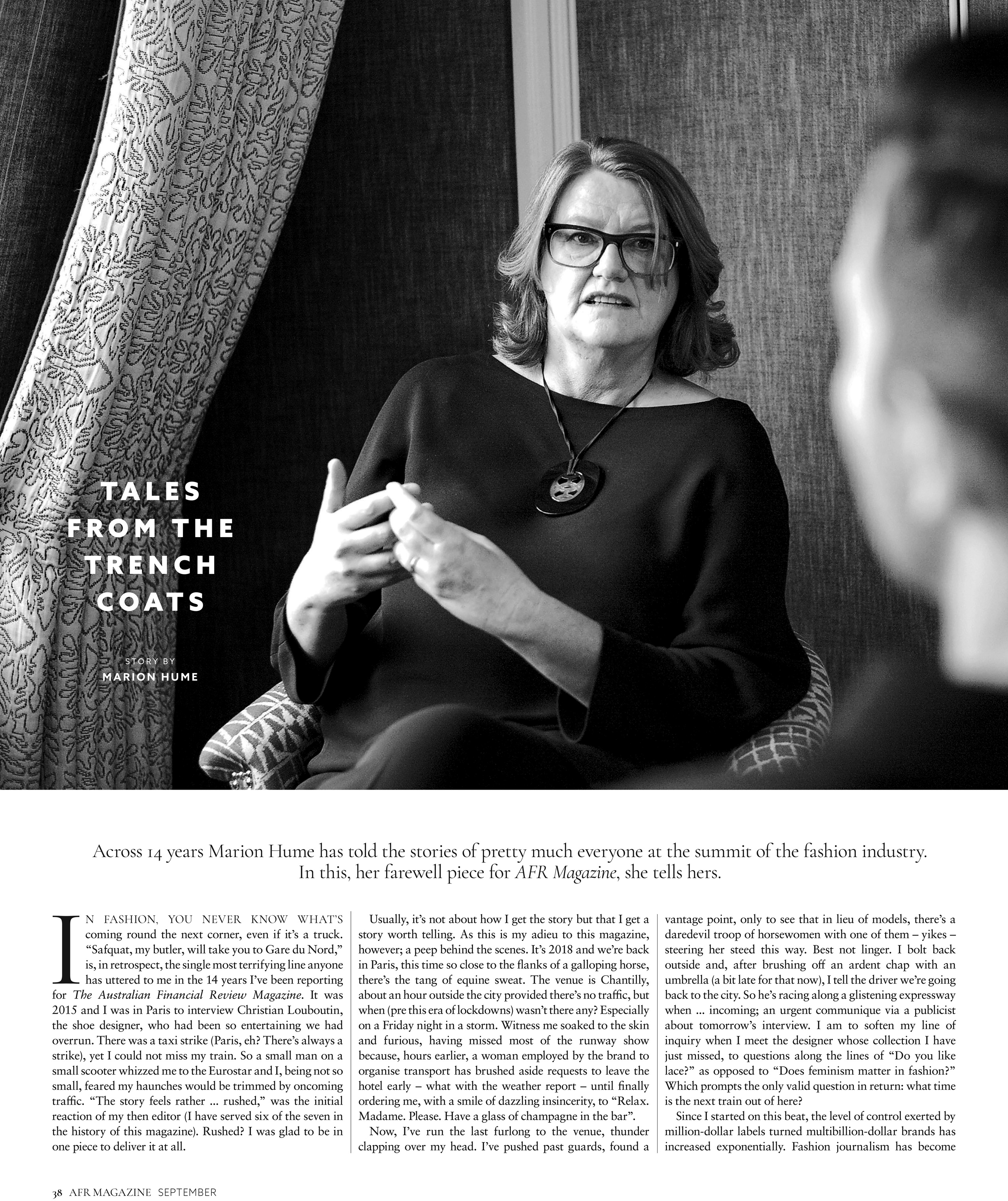
by Marion Hume
How can you copyright a colour? The notion seems ludicrous. Imagine some swaggering luxury goods titan looking up at a rainbow and pronouncing, “I want red for this brand, orange for that brand, worldwide usage for yellow, all rights for green and I’m banning anyone else from blue, indigo, violet.”
Yet who owns what tone has become a hot topic. A while back, I was asked to write a letter in support of the French shoemaker, Christian Louboutin’s right to red and I was happy to do so. Louboutin’s red soles are a potent brand signifier. So no wonder he saw red and sued when Yves Saint Laurent offered red soled shoes too. The presiding judge found against him noting that no one designer should have a “monopoly” on any color. At time of writing, the case is on appeal.
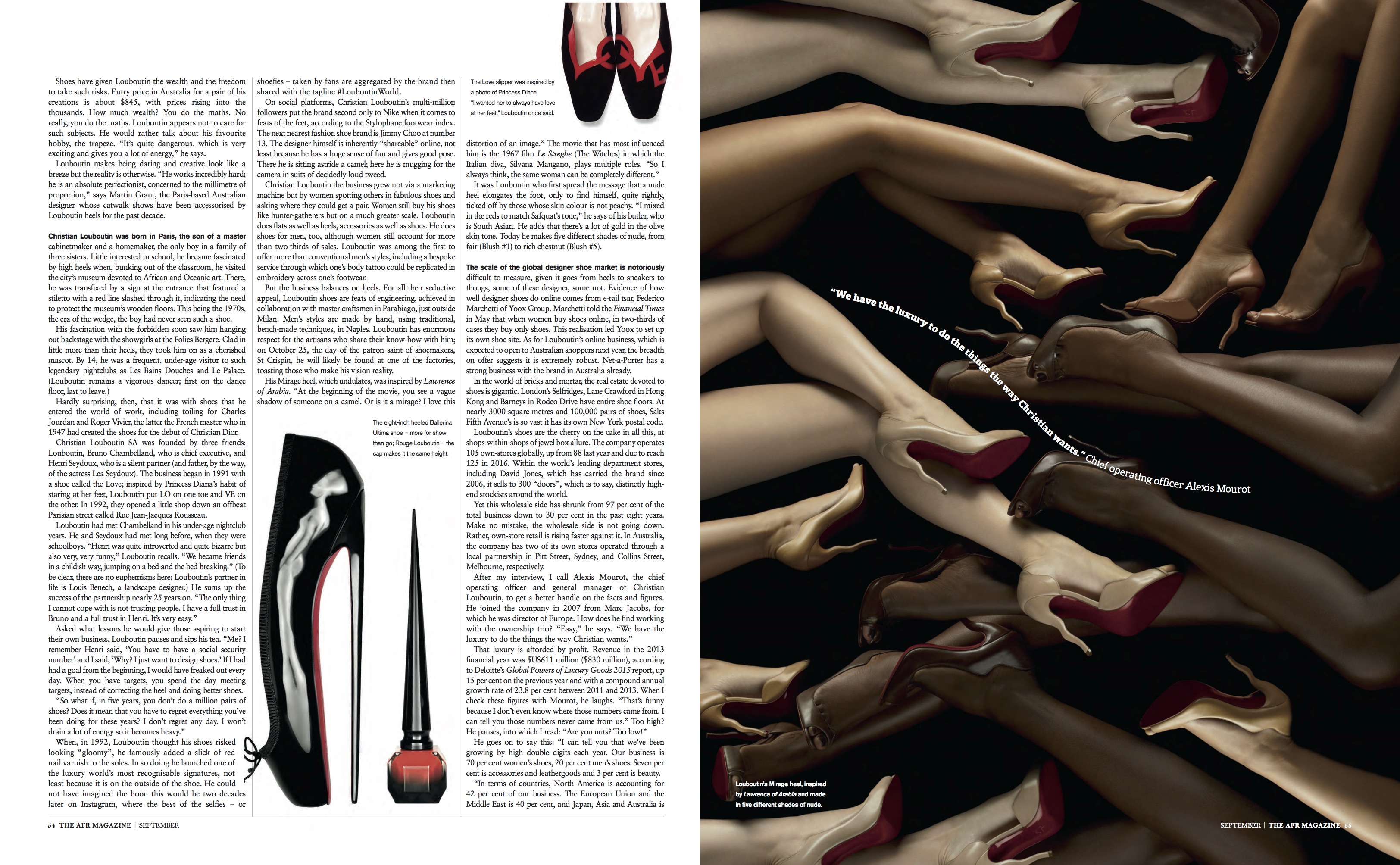
Louboutin became associated with red by accident. He thought the black soles of his first designs for high heels looked depressingly dull so he grabbed some nail lacquer and added D.I.Y. pizazz. Does he own red? Powerful forces rallying to his support certainly hope so. Tiffany & Co. has filed something called an amicus curiae because if Loubi loses, who owns the blue the jewellers have been using since 1845?
There’s no question, surely, that Hermes owns orange. Yet like Loubi-red, Hermes orange was an accident. Until the end of the 1930s, the company’s packaging was brown. But under the Nazi occupation, paper stock became near-impossible to find. Someone heard of a cake shop that had had to close. The sunny packaging in which people had carried home gateaux in happier times was available because other luxury marques thought it too vulgar. And so orange came to signify hope, then chic and now – certainly if it is me who is the lucky recipient of an Hermes gift – absolute joy.
Hermes orange has gone even further, to the point that it is synonymous with Paris itself, for orange = Hermes = Parisian chic. Yet when you look at the fabric of Paris, it isn’t orange of course, it’s dove grey or in the watery light of early spring, the most ravishing lavender. And hardly anyone in Paris ever wears orange, with the exception of the Australian, Marc Newson, who has a penchant for vivid windcheaters.
Elsewhere, when nature, light and beautiful architecture can’t be called upon, a splash of bright paint can be transforming in how we see a city. I’ve never been to Tirana, Albania, among the most isolated capitals in Europe. But my interest was piqued when the mayor decreed that brutalist architecture – and thus citizens’ lives – could be improved with bold stripes of yellow, green, blue and red applied all over the tower blocks. Similarly, in the favelo of Rio and the slums of Nairobi, painting rundown buildings in vibrant colours is starting to have the effect of cutting criminality, which it turn gives locals more power over their lives.
This isn’t new to me. In 1851, a social experiment took place in a notorious London slum. When a row of cheap little terrace houses went up, each was rendered and painted a different colour to see if poor people might behave better if they lived in pretty houses. As my neighbours and I quip today, as we stand outside homes still painted primrose, pistachio and rose, we do. We also know our street brightens the day of many who walk through because they stop and tell us so. Colour is cheerful. Should fashion designers ever get ownership of it, then? I think, sometimes, yes. But given my suspicions that there are luxury goods titans out there would love to project brand logos onto the moon if we let them, we must stay vigilant. We hold the monopoly on how we colour our world.